Is There a Better Way Than PCA?
by Joshua Loyal
Jan 11, 2018
· 3353 words
· 16 minutes read
Note: Checkout the sliced python package I developed for this blog post!
Always use the right tool for the job. This is useful guidance when building a machine learning model. Most data scientists would agree that support vector machines are able to classify images, but a convolutional neural network works better. Linear regression can fit a time-series, but an ARIMA model is more accurate. In each case what separates the approaches is that the second algorithm specifically address the structure of the problem. CNNs understand the translation invariance of an image and an ARIMA model takes advantage of the sequential nature of a time-series.
The logic is no different for dimension reduction. Performing dimension reduction for a supervised learning task should not be agnostic to the structure of the target. This insight motivates the paradigm of sufficient dimension reduction. In the remaining post I introduce the concept of sufficient dimension reduction through a toy example of a surface in three-dimensions. Then I compare a popular algorithm for SDR known as sliced inverse regression with principal component analysis (PCA) on a supervised learning problem.
What is Sufficient Dimension Reduction?
Let’s say we have a collection of features , and we want to predict some target . In other words, we want to gain some insight about the conditional distribution . When the number of features is high, it is common practice to remove irrelevant features before moving onto the prediction step. This removal of features is dimension reduction. We are reducing the number of features (aka dimensions) in our dataset.
Those familiar with dimension reduction may be thinking: “I’ll use PCA or t-SNE for this!”. While these techniques are great, they fall under the category of unsupervised dimension reduction. Notice that the unsupervised setup is different than the situation described above. Unsupervised learning finds structure in the distribution of itself. No involved. For example, PCA reduces the number of features by identifying a small set of directions that explains the greatest variation in the data. This set of directions is known as a subspace. Of course, there is no reason to believe that this subspace contains any information about the relationship between and . Since PCA does not use information about when determining the directions of greatest variation, information about may be orthogonal to this space.
To avoid the situation above, sufficient dimension reduction keeps the relationship between and in mind. The goal is to find a small set of directions that can replace without loss of information on the conditional distribution 1. This special subspace is called the dimension reducing subspace (DRS) or simply 2. If we restrict our attention to the DRS we will find that the conditional distribution is the same as the distribution . But now we have a much smaller set of features! This allows us to better visualize our data and possibly gain deeper insights.
Example: A Quadratic Surface in 3D
Let’s develop some intuition about dimension reducing subspaces and how we can find them. Consider two features and that indicate the coordinates of a point on a two-dimensional plane. Associated with each pair of points, , is the height of a surface that lies above it. Denote the height of the surface by the variable . The surface is a quadratic surface with . So the two features are (, ) and the target is the height of the quadratic, . The surface is displayed below:
import numpy as np
# !!space
from matplotlib import pyplot as plt
from mpl_toolkits.mplot3d import Axes3D
# !!space
# generate data y = X_1 ** 2 + 0 * X_2
def f(x, y):
    return x ** 2
# !!space
x1 = np.linspace(0, 6, 30)
x2 = np.linspace(0, 6, 30)
# !!space
X1, X2 = np.meshgrid(x1, x2)
Y = f(X1, X2)
# !!space
# plot 3d surface y = x_1 ** 2
fig, ax = plt.subplots(figsize=(10,10), subplot_kw={'projection':'3d'})
ax.plot_surface(X1, X2, Y, rstride=1, cstride=1,
                cmap='viridis', edgecolor='none')
# !!space
# rotate and label our axes
ax.view_init(35, -75)
ax.set_title('$y = x_1^2$');
ax.set_xlabel('$x_1$')
ax.set_ylabel('$x_2$')
ax.set_zlabel('y')
# !!space
plt.show()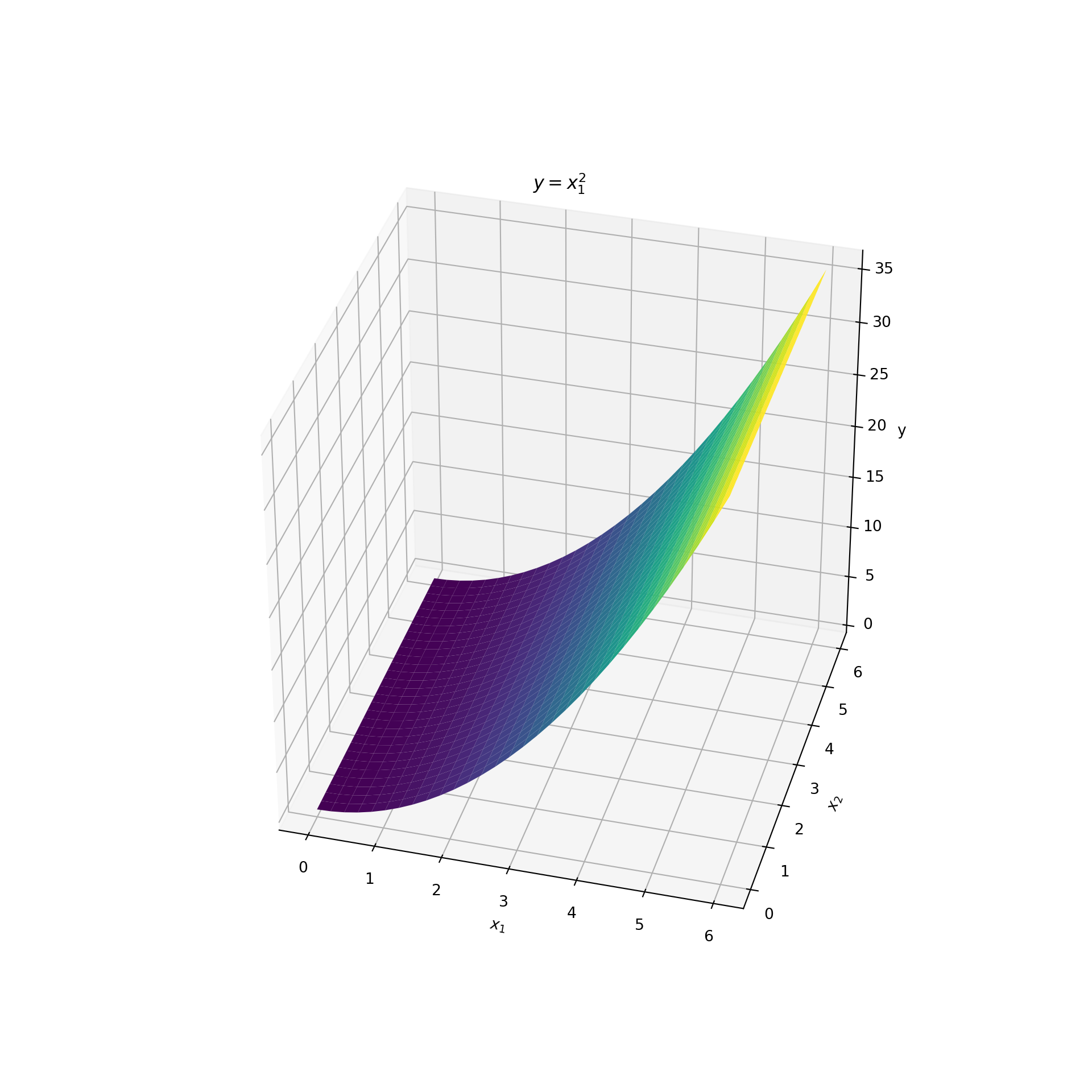
To identify the dimension reducing subspace we start by answering the following question: what are all the possible subspaces associated with this dataset? They are the subspaces of the -plane. This is a plane in two-dimensions. But the subspaces of a two-dimensional plane are all the one-dimensional lines that lie in that plane and that pass through the origin . The plot below displays a few examples:
from loyalpy.plots import abline
from loyalpy.annotations import label_abline
# !!space
fig, ax = plt.subplots(figsize=(10, 10))
# !!space
# plot lines in the plane
ablines = [([-5, -5], [5, 5]),
           ([-5, 0], [5, 0]),
           ([0, -5], [0, 5]),
           ([-5, 5], [5, -5])]
for a_coords, b_coords in ablines:
    abline(a_coords, b_coords, ax=ax, ls='--', c='k', lw=2)
# !!space
# labels
label_abline([-5, 5], [5, -5], '$\hat{\\beta}$ = (1, -1)', -2, 1.5)
label_abline([-5, -5], [5, 5], '$\hat{\\beta}$ = (1, 1)', 1.5, 1.7)
label_abline([-5, 0], [5, 0], ' $x_1$-axis: $\hat{\\beta}$ = (1, 0)', -3, 0.2)
label_abline([0, 5], [0, -5], '$x_2$-axis: $\hat{\\beta}$ = (0, 1)', 0.3, 2)
# !!space
ax.set_xlabel('$x_1$')
ax.set_ylabel('$x_2$')
ax.set_xlim(-5, 5)
ax.set_ylim(-5, 5)
# !!space
plt.show()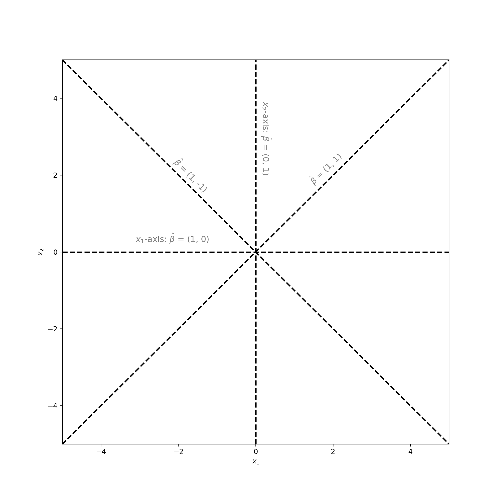
Of all these subspaces there is a single dimension reducing subspace. But what is it? Recall that . This is a function of only . Since does not depend on , we could drop from further analysis and still be able to compute . This means that contains all the information about . In the language of subspaces: dropping corresponds to projecting the data onto the -axis. But the -axis is a valid subspace. Therefore, the dimension reducing subspace is the -axis!
But how would a machine learning algorithm tell us to project the data onto the -axis? The outputs of the algorithm are numbers not subspaces or projections. In the plot above you may have noticed that each subspace is labeled with a vector . This vector tells us the direction of the line associated with the subspace. In other words, the vector spans that subspace. More importantly, this vector can project data onto its associated subspace. Just take the dot product of with the data. For example to project a point onto the -axis let , so that
Therefore, finding the dimension reducing subspace boils down to identifying the direction vector . If we can estimate , then we can create a lower dimensional dataset by using in our analysis instead of .
To see how we can visually identify the dimension reducing subspace lets look at the surface again. This time I’ve labeled the direction of the dimension reducing subspace with an arrow.
import numpy as np
# !!space
from mpl_toolkits.mplot3d import Axes3D
from loyalpy.annotations import Arrow3D
# !!space
# generate data y = X_1 ** 2 + 0 * X_2
def f(x, y):
    return x ** 2
# !!space
x1 = np.linspace(0, 6, 30)
x2 = np.linspace(0, 6, 30)
# !!space
X1, X2 = np.meshgrid(x1, x2)
Y = f(X1, X2)
# !!space
# plot 3d surface y = x_1 ** 2
fig, ax = plt.subplots(figsize=(10,10), subplot_kw={'projection':'3d'})
ax.plot_surface(X1, X2, Y, rstride=1, cstride=1,
                cmap='viridis', edgecolor='none')
# !!space
# An arrow indicating the central subspace
arrow = Arrow3D([0, 6], [3, 3],
                [0, 0], mutation_scale=20,
                lw=3, arrowstyle="-|>", color="k")
ax.add_artist(arrow)
ax.text(4, 3.5, 0, "$\hat{\\beta} = (1, 0)$", (1, 0, 0),
        color='k', fontsize=12)
# !!space
# rotate and label our axes
ax.view_init(35, -75)
ax.set_title('$y = x_1^2$');
ax.set_xlabel('$x_1$')
ax.set_ylabel('$x_2$')
ax.set_zlabel('y')
# !!space
plt.show()
Notice how the height of the surface does not change along the dimension. This is why carries no information about . Now look at the direction associated with the dimension reducing subspace, or the -axis. Notice how all the variation in occurs along this line. This is why carries all the information about .
Now look at what happens when we rotate the plot so that the -axis is aligned with the direction of . This rotation is equivalent to projecting the data onto the dimension reducing subspace. This rotation / projection is shown below:
# plot the surface
ax = plt.axes(projection='3d')
ax.plot_surface(X1, X2, Y, rstride=1, cstride=1,
                cmap='viridis', edgecolor='none')
# !!space
# label beta
arrow = Arrow3D([0, 6], [3, 3],
                [0, 0], mutation_scale=20,
                lw=3, arrowstyle="-|>", color="k")
ax.add_artist(arrow)
ax.text(4, 3.5, 2, "$\hat{\\beta} = (1, 0)$", (1, 0, 0), color='k', fontsize=12)
# !!space
# label the axes and rotate our view
ax.view_init(0, -90)
ax.set_title('$y = x_1^2$');
ax.set_xlabel('$x_1$')
ax.set_ylabel('$x_2$')
ax.set_zlabel('y')
# !!space
plt.show()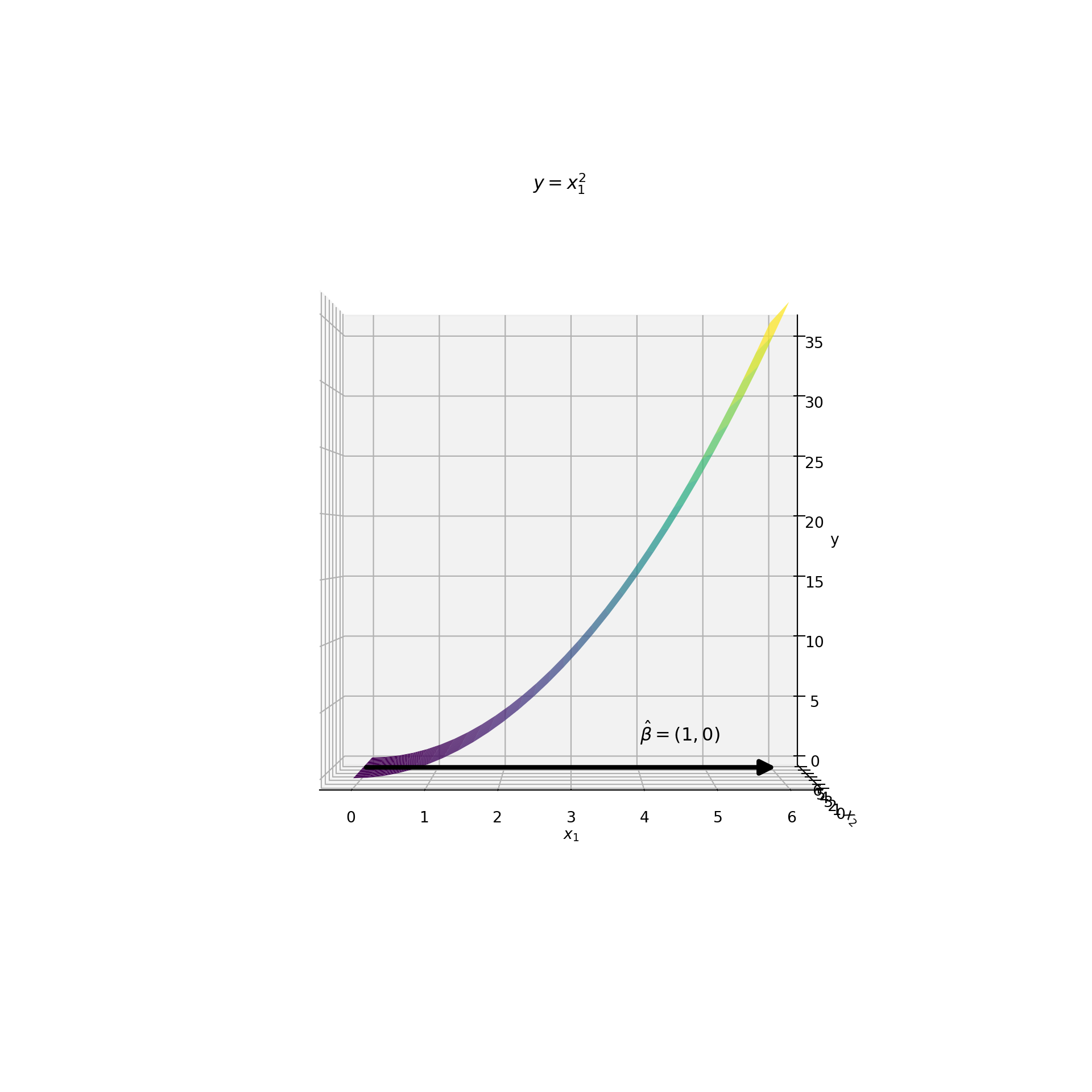
Something amazing happened! Although the plot is a two-dimensional surface, it appears like a one-dimensional curve! Each value on the -axis corresponds to only a single value. If we chose any other direction the function would not be one-to-one. Furthermore, the relationship between and is clear in this space. They have a quadratic relationship. In other words, this projection reduces the number of features from two to one without compromising the functional form . This is what it looks like when the reduction of features is sufficient!
Sliced Inverse Regression VS. PCA
Now that we’ve seen what sufficient dimension reduction can accomplish, we are ready to explore the differences between unsupervised and sufficient dimension reduction. To do this I chose to compare PCA with an algorithm known as sliced inverse regression (SIR). SIR was developed in 1991 by Ker-Chau Li from UCLA 3 and expanded upon by Dennis Cook and Sanford Weisberg from the University of Minnesota 4. It uses the idea of inverse regression to estimate the dimension reducing subspace of the data. I use the SlicedInverseRegression code in the sliced package to fit a SIR model. PCA is carried out using sklearn’s PCA implementation.
The Data
Consider the following data generating process:
The dataset consists of two uncorrelated features, and , sampled from a normal distribution. The target is a sine function applied to a linear combination of and . There is also independent gaussian noise, , applied to the sinusoidal signal.
A scatterplot of vs. is displayed below. The points are colored according to . Brighter colors correspond to larger values of the target. The dimension reducing subspace is labeled with a dashed line.
import numpy as np
import matplotlib.pyplot as plt
# !!space
from loyalpy.annotations import label_line, label_abline
# !!space
np.random.seed(123)
# !!space
n_samples = 500
X = np.random.randn(n_samples, 2)
y = np.sin(0.7 * X[:, 0] - 0.7 * X[:, 1]) + 0.1 * np.random.randn(n_samples)
# !!space
fig, ax = plt.subplots(figsize=(10, 10))
# !!space
# label the central subspace
line, = ax.plot([-5, 5], [5, -5], ls='--', c='k', alpha=0.5)
label_line(line, 'dimension reducing subspace', -4, 2)
# !!space
# scatter plot of points
ax.scatter(X[:, 0], X[:, 1], c=y, cmap='viridis', edgecolors='k', s=80)
ax.set_xlim(-5, 5)
ax.set_ylim(-5, 5)
ax.set_xlabel('$X_1$')
ax.set_ylabel('$X_2$')
# !!space
plt.show()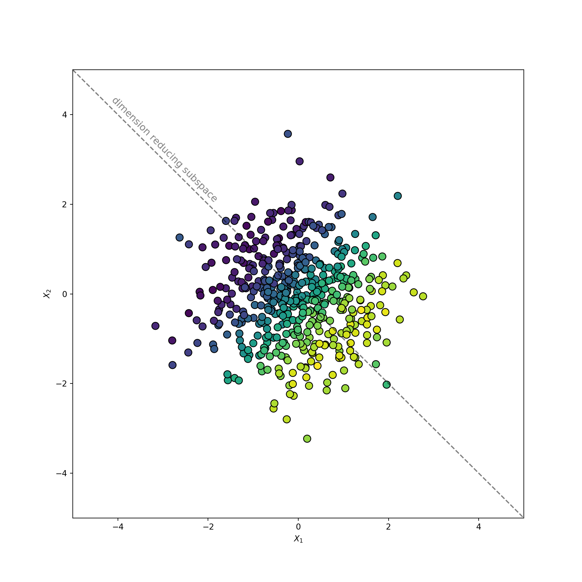
Notice how the dimension reducing subspace follows the color gradient of the target. This behavior distinguishes the dimension reducing subspace. It maximally preserves the information in .
What Should We See?
Let’s take a step back and identify the dimension reducing subspace assuming the data generating process is known. According to the equations above the mean of is determined by a single feature:
For example, if , then . This demonstrates that the conditional expectation is a function of a single variable, , instead of the two variables and . This variable reduce the dimension of the dataset from two to one without losing any information about .
But is a derived feature not the dimension reducing subspace or its associated direction. So what direction is associated with the variable ? Notice that is associated with the vector . This is because is calculated by carrying out the product:
Therefore, the dimension reducing subspace is the one dimensional subspace spanned by the vector .
Estimating
Of course we do not know the data generating process or that exists when setting out to perform an analysis. Nevertheless, we still want to reduce the number of features in this dataset from two to one. Both SIR and PCA will accomplish our goal. They will project our data into a one dimensional subspace. But which one is better? From the analysis above we know the best subspace is , which is also the dimension reducing subspace that SIR estimates. But how off will PCA be from this subspace? If PCA is close, then who cares about all this extra theory? Let’s fit both algorithms and compare the results to find out.
Fitting the algorithms is simple since they both adhere to the sklearn transformer API. A single hyperparameter n_components indicates the dimension of the subspace. In this case we want a single direction, so we set n_components=1. The components_ attribute stores the estimated direction of the subspace once the algorithm is fit. The only difference between the algorithms is that SIR needs to know about the target during the fitting process. The following code fits the two algorithms and extracts the estimated vector:
from sliced import SlicedInverseRegression
from sklearn.decomposition import PCA
# !!space
# fit sliced's SIR. Remember we need to pass the target in as well!
sir = SlicedInverseRegression(n_components=1).fit(X, y)
sir_direction = sir.components_[0, :]
# !!space
# fit sklearn's PCA. Unsupervised so it has no knowledge of y.
pca = PCA(n_components=1).fit(X)
pca_direction = pca.components_[0, :]
With the models fit to the data, we can compare the directions found by PCA and SIR:
# scatter plot of points
fig, ax = plt.subplots(figsize=(10,10))
ax.scatter(X[:, 0], X[:, 1], c=y, cmap='viridis', alpha=0.2, edgecolors='k', s=80)
ax.set_xlim(-5, 5)
ax.set_ylim(-5, 5)
ax.set_xlabel('$X_1$')
ax.set_ylabel('$X_2$')
# !!space
# label the central subspace
line, = ax.plot([-5, 5], [5, -5], ls='--', c='k', alpha=0.5)
label_line(line, 'dimension reducing subspace', -4, 2)
# !!space
# label subspaces found by PCA and SIR
arrow_aes = dict(head_width=0.2,
                 head_length=0.2,
                 width=0.08,
                 ec='k')
ax.arrow(0, 0, pca_direction[0], pca_direction[1], fc='darkorange', **arrow_aes)
label_abline((0, 0), pca_direction, 'PCA', -0.7, -0.2, color='darkorange', outline=True)
# !!space
ax.arrow(0, 0, sir_direction[0], sir_direction[1], fc='deepskyblue', **arrow_aes)
label_abline((0, 0), sir_direction, 'SIR', 0.5, -0.5, color='deepskyblue', outline=True)
# !!space
plt.show()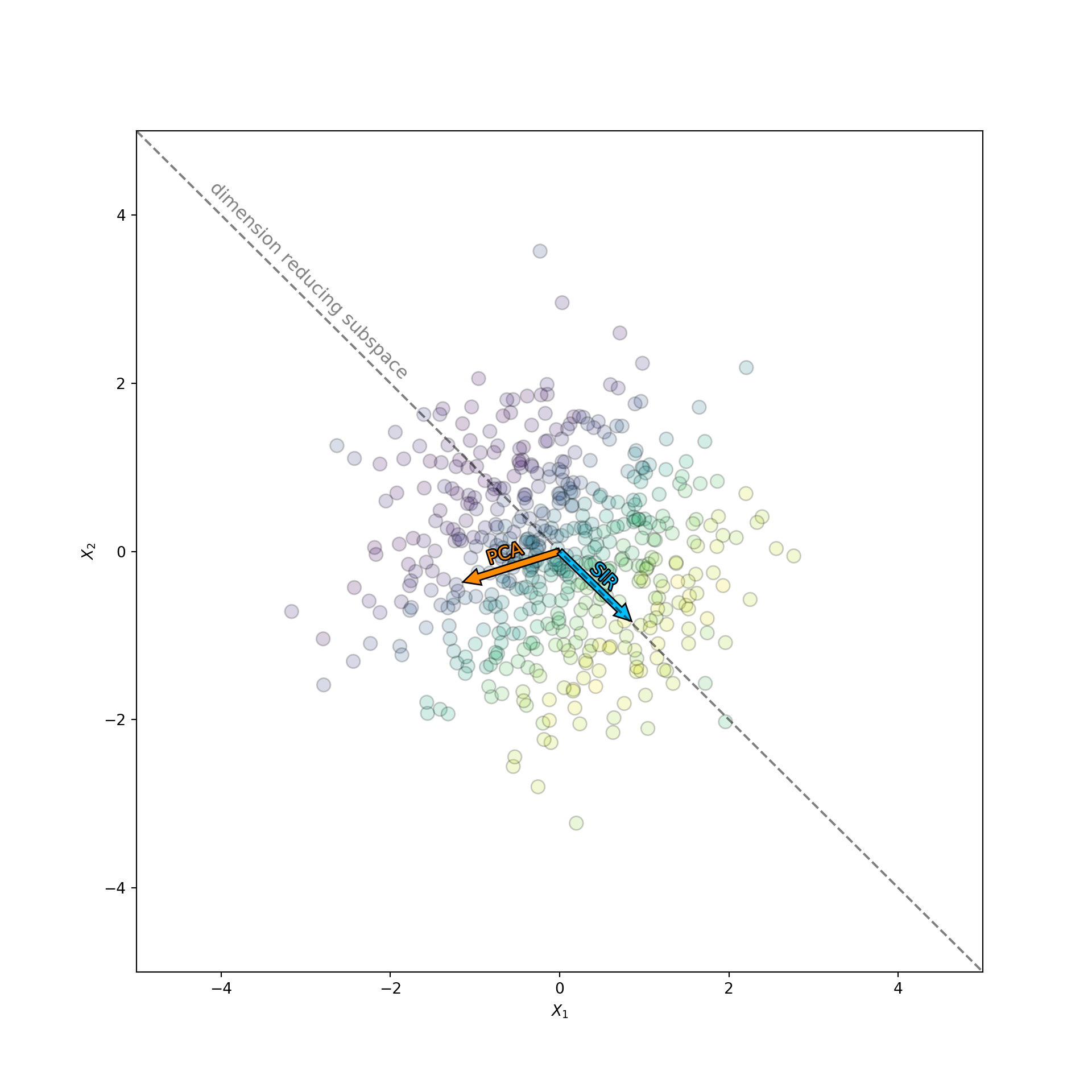
The orange arrow corresponds to the subspace found by PCA, while the blue arrow corresponds to the subspace found by SIR. Notice how the direction found by PCA has nothing to do with . If it did, then it would point along the color gradient. Instead PCA picks the direction that has the largest spread along the data cloud. In contrast, SIR knows about . This information allows SIR to orients itself nicely along the color gradient, which contains all the information about the target.
In fact, the performance of PCA is even worse than it appears. Since the data is generated from an isotropic gaussian blob, the PCA directions will be completely random upon replication. PCA chooses the direction that happens to have the most variance in the sample. But the data is isotropic, so this direction is uniformly distributed over all possible subspaces. The variance of the first principal component is huge! This is catastrophic if you are an analyst trying to make sense of the data. You may trick yourself into thinking the direction chosen by PCA has some special meaning, when in fact it does not. To see this more clearly I repeated this experiment multiple times. Each time I measured the angle between the dimension reducing subspace, , and the direction chosen by PCA and SIR. I then displayed the distribution of the angle in a histogram. The result is displayed below:
def normalize_it(vec):
  """Normalize a vector."""
  vec = vec.astype(np.float64)
  vec /= np.linalg.norm(vec)
  return vec
# !!space
def replicate_angle(n_samples=500, n_iter=2500):
    """Caculate the SIR and PCA angles for `n_iter` replications."""
    # direction of dimension reducing subspace
    true_direction = normalize_it(np.array([1, -1]))
    # !!space
    # iterate the experiment multiple times and see how the angle changes
    pca_angle = np.empty(n_iter, dtype=np.float64)
    sir_angle = np.empty(n_iter, dtype=np.float64)
    for i in range(n_iter):
        np.random.seed(i)
        # !!space
        X = np.random.randn(n_samples, 2)
        y = np.sin(0.7 * X[:, 0] - 0.7 * X[:, 1]) + 0.1 * np.random.randn(n_samples)
        # !!space
        sir = SlicedInverseRegression(n_components=1).fit(X, y)
        sir_direction = normalize_it(sir.components_[0, :])
        # !!space
        pca = PCA(n_components=1).fit(X)
        pca_direction = normalize_it(pca.components_[0, :])
        # !!space
        cos_angle = np.dot(pca_direction, true_direction)
        pca_angle[i] = np.arccos(cos_angle)
        # !!space
        cos_angle = np.dot(sir_direction, true_direction)
        sir_angle[i] = np.arccos(cos_angle)

    return pca_angle, sir_angle
# !!space
# plot the results
pca_angle, sir_angle = replicate_angle()
# !!space
fig, (ax1, ax2) = plt.subplots(2, 1, sharex=True, figsize=(10, 10))
# !!space
# less bins since everything is basically at zero within precision
ax1.hist(sir_angle, color="steelblue", edgecolor="white", linewidth=2, bins=3)
ax1.set_title('SIR')
ax1.set_xlabel('Angle between $\hat{\\beta}_{true}$ and $\hat{\\beta}_{sir}$')
ax1.set_ylabel('Counts')
# !!space
ax2.hist(pca_angle, color="steelblue", edgecolor="white", linewidth=2, bins=20)
ax2.set_title('PCA')
ax2.set_xlabel('Angle between $\hat{\\beta}_{true}$ and $\hat{\\beta}_{pca}$')
ax2.set_ylabel('Counts')
# !!space
plt.show()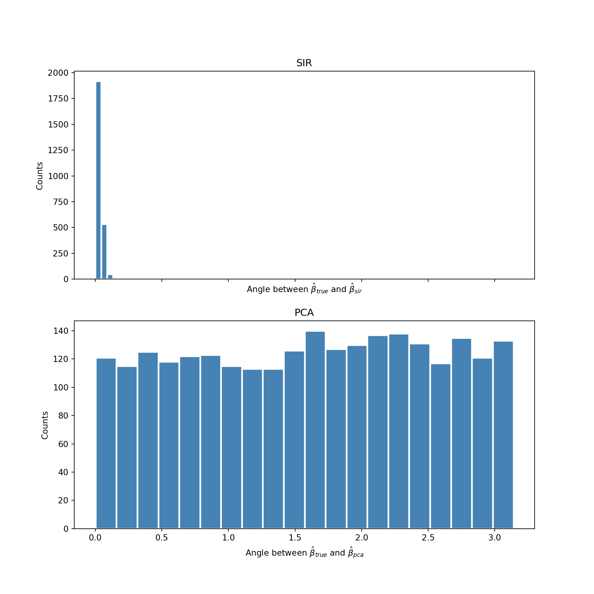
As expect the directions estimated by PCA (the histogram on the bottom) are uniformly distributed from 0 to . The direction found by PCA is meaningless. In contrast, the distribution of the angle found by SIR (the histogram on the top) concentrates itself around zero. Meaning it almost always finds the direction of the dimension reducing subspace for this problem.
Finally, let’s take a look at what the data looks like in the dimension reducing subspace found by SIR and the subspace found by PCA. The transform method projects the data into these subspaces:
# project data into the subspaces identified by SIR and PCA
X_sir = sir.transform(X)
X_pca = pca.transform(X)
The relationship between these new features and is visualized in a two-dimensional scatterplot:
f, (ax1, ax2) = plt.subplots(1, 2, sharey=True, figsize=(20, 10))
# !!space
ax1.scatter(X_sir[:, 0], y, c=y, cmap='viridis', edgecolors='k', s=80)
ax1.set_title('SIR Subspace')
ax1.set_xlabel('$\mathbf{X}\hat{\\beta}_{sir}$')
ax1.set_ylabel('y')
# !!space
ax2.scatter(X_pca[:, 0], y, c=y, cmap='viridis', edgecolors='k', s=80)
ax2.set_title('PCA Subspace')
ax2.set_xlabel('$\mathbf{X}\hat{\\beta}_{pca}$')
ax2.set_ylabel('y')
# !!space
plt.show()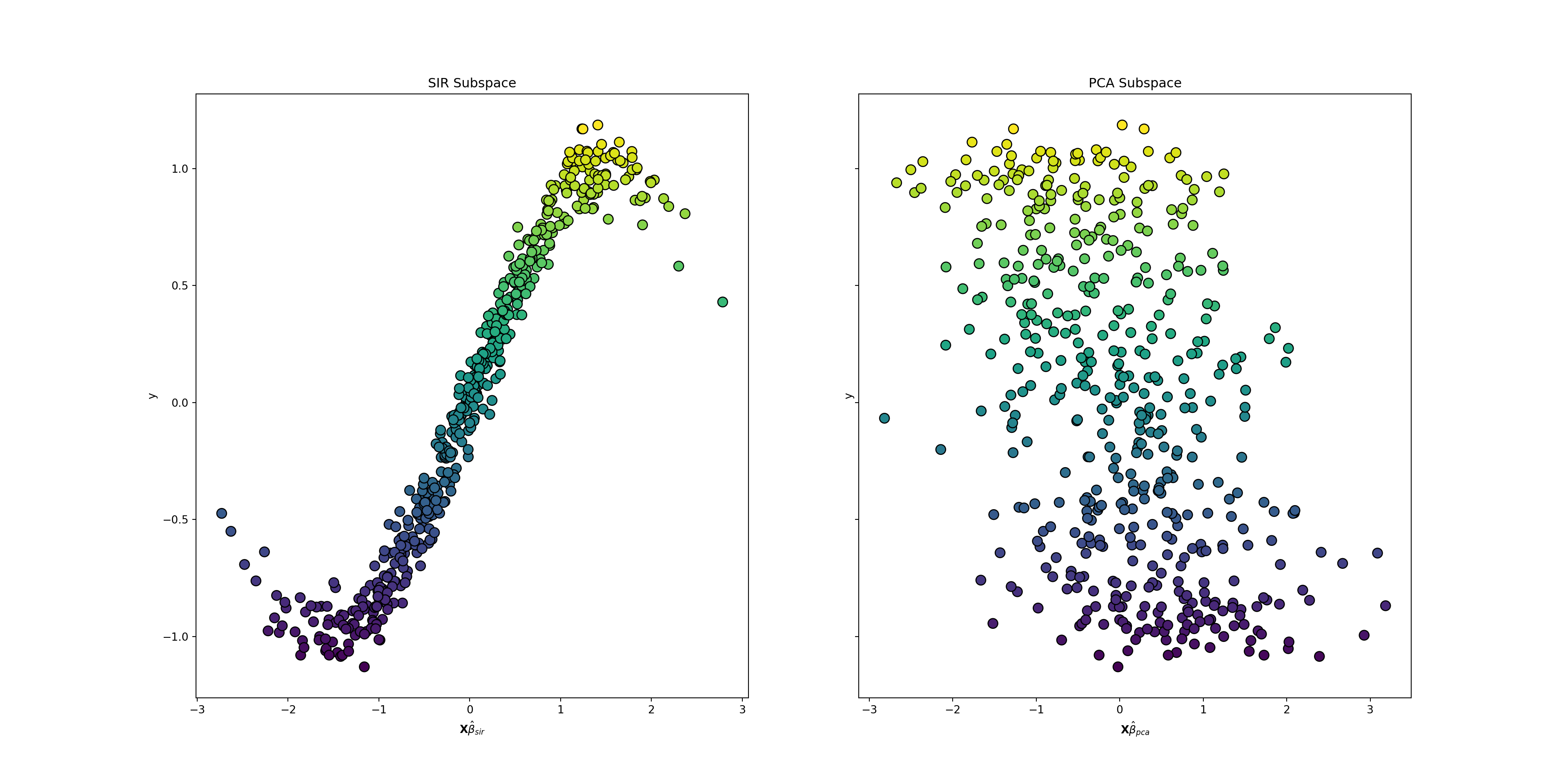
The power of the SIR algorithm is evident in these plots.The sinusoidal pattern that links the features with the target is visible in the SIR plot on the left. This pattern is almost washed out in the PCA plot on the right. In this plot the data is spread almost uniformly about the plane. PCA destroys the relationship between the features and the target, while SIR preserves it.
Conclusion
It is important to think critically about the dimension reduction algorithm used to analyze a dataset. The algorithm should reduce the features in a way that preserves the information of interest instead of finding spurious structure. Sufficient dimension reduction and sliced inverse regression are one such way of looking for structure in a supervised learning setting.
However, you should always remain diligent. These algorithms are not perfect. In particular, SIR fails to estimate the dimension reducing subspace when the conditional density is symmetric in . The SAVE algorithm (also in the sliced package) overcomes this limitation. However, SAVE fails to pick up on simple linear trends easily estimated by SIR. If possible both SIR and SAVE should be used together in practice. Of course, I did not actually go through the mechanics of the SIR algorithm. That is the subject of a future blog post.
This may sound similar to a sufficient statistic in mathematical statistics. In fact it should! They are both based on the same idea of sufficiency.↩
Note that there can be more than one dimension reducing subspace. Typically we are interested in the smallest dimension reducing subspace, which may not even exist. If it does then it is unique and called the central subspace. This is analogous to a minimum sufficient statistic in mathematical statistics.↩
Li, K C. (1991) “Sliced Inverse Regression for Dimension Reduction (with discussion)”, Journal of the American Statistical Association, 86, 316-342.↩
Cook, D. and Weisberg , S. (1991) “Sliced Inverse Regression for Dimension Reduction: Comment”, Journal of the American Statistical Association, 86, 328-342.↩